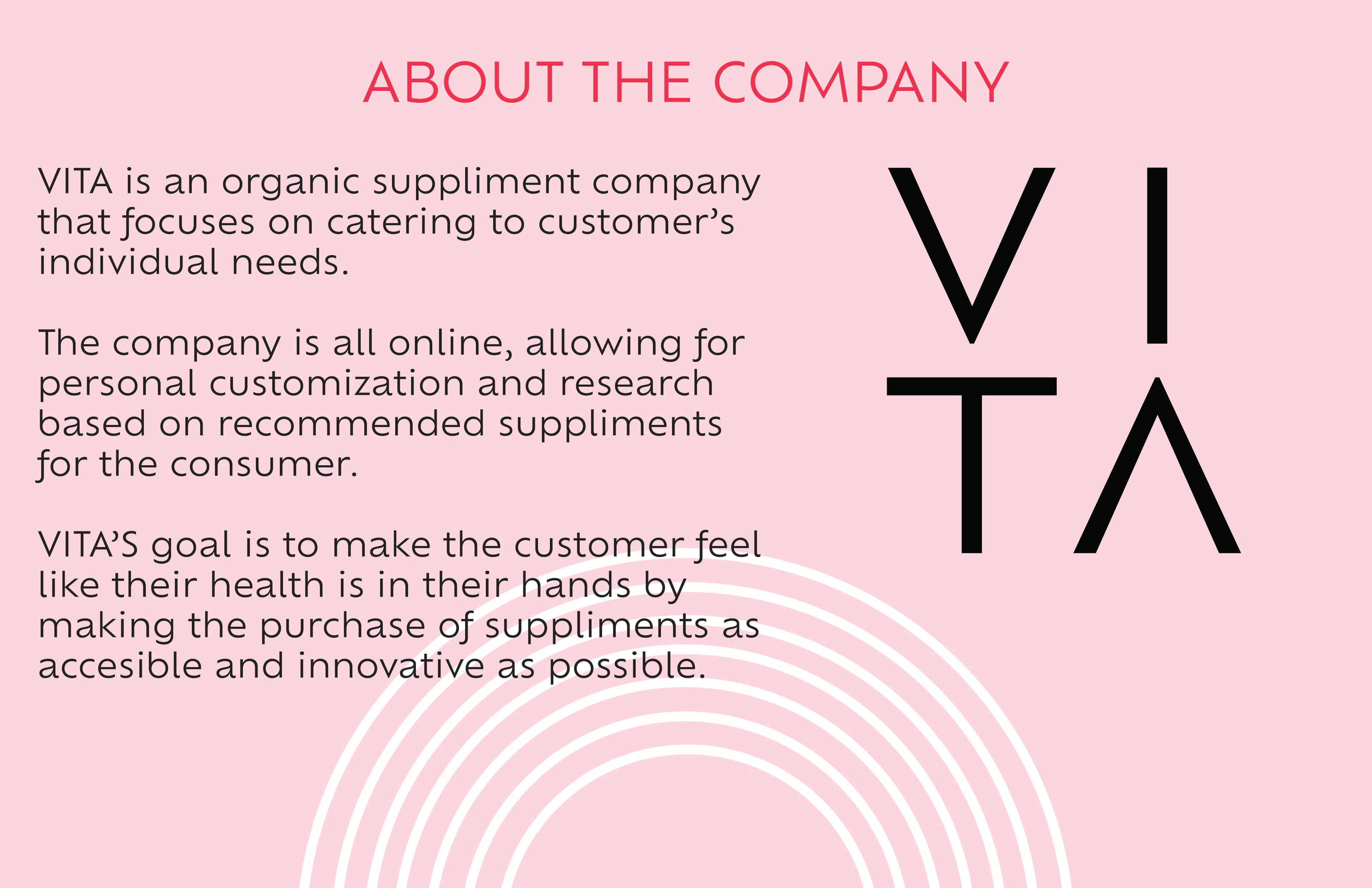
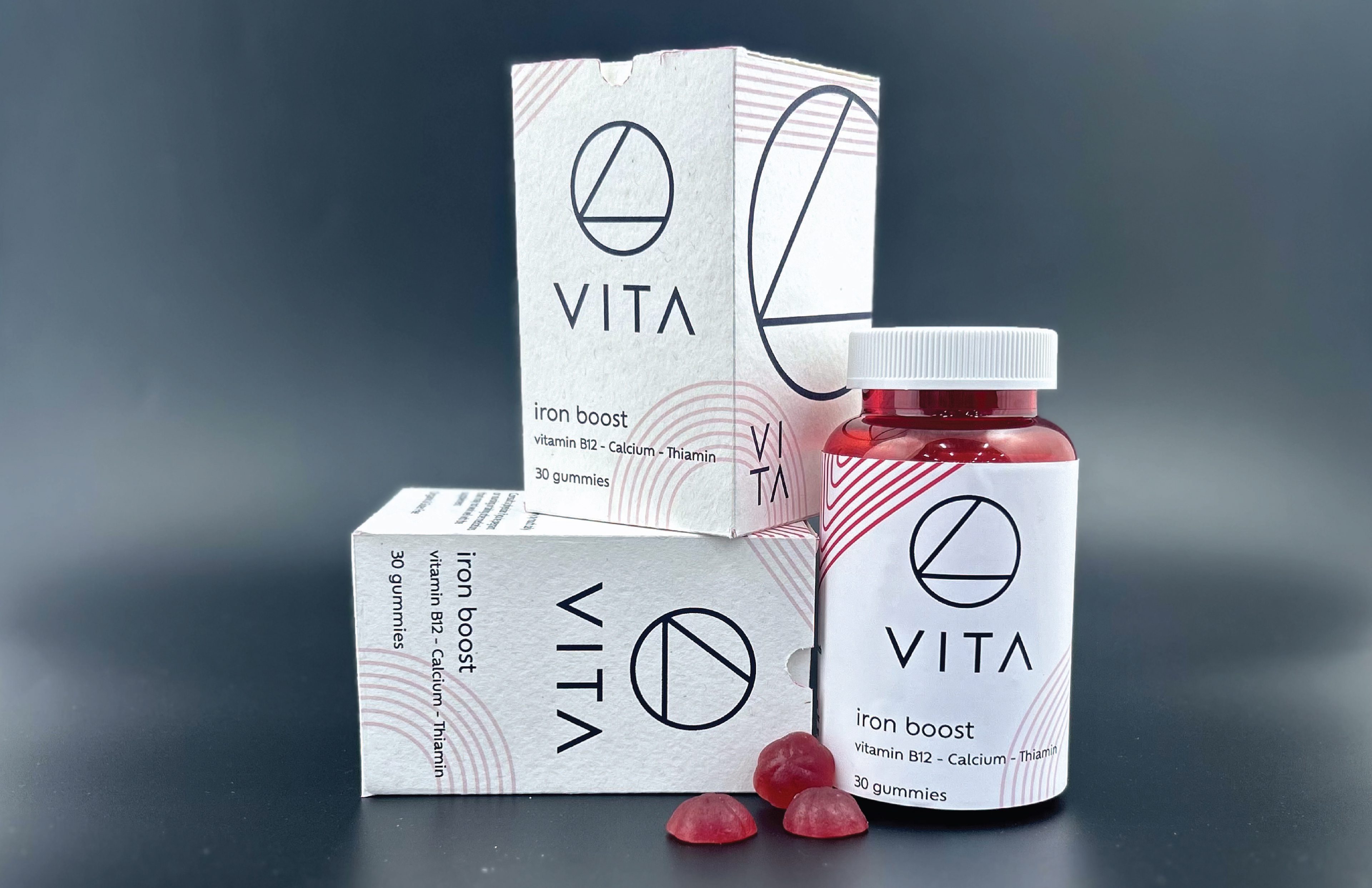
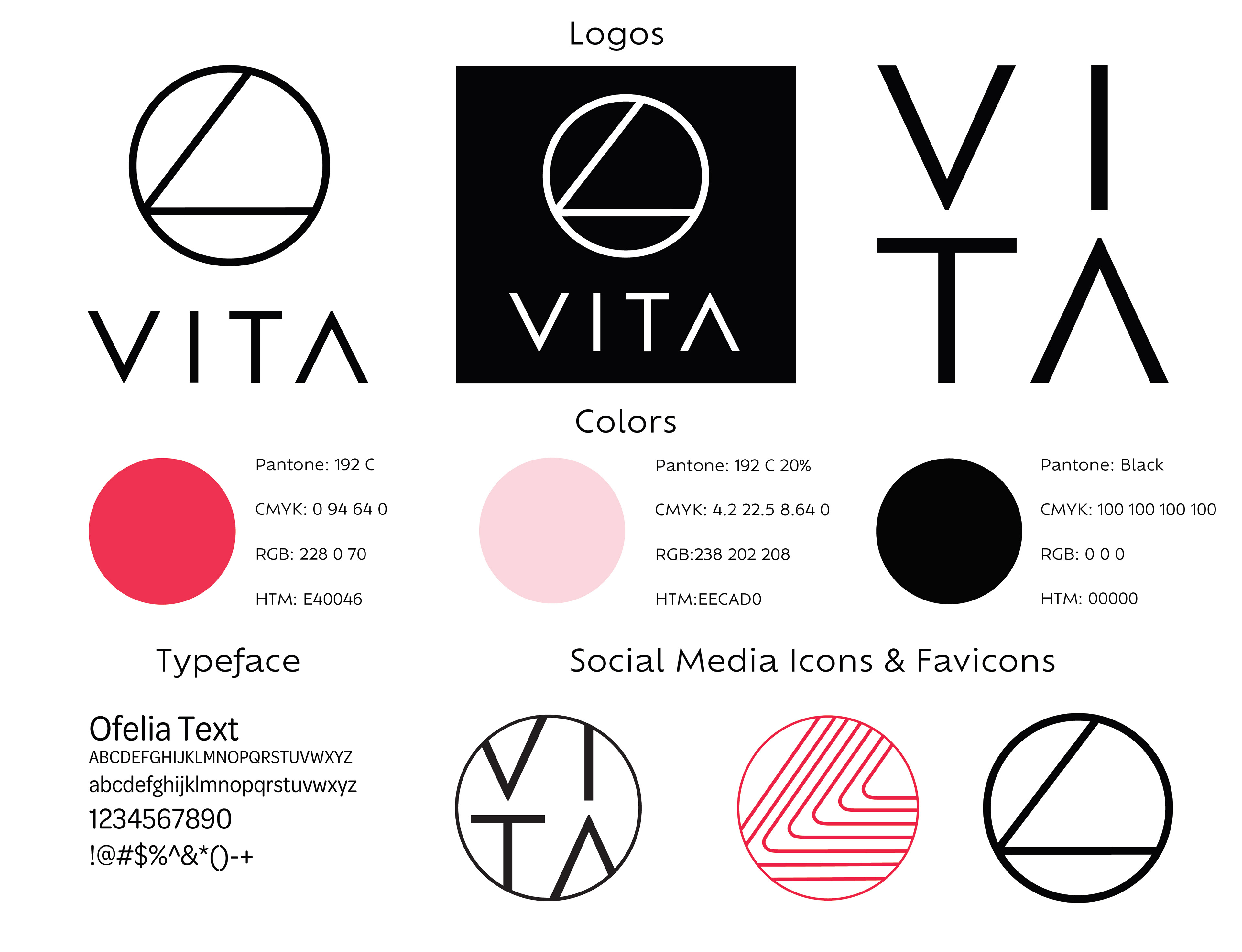

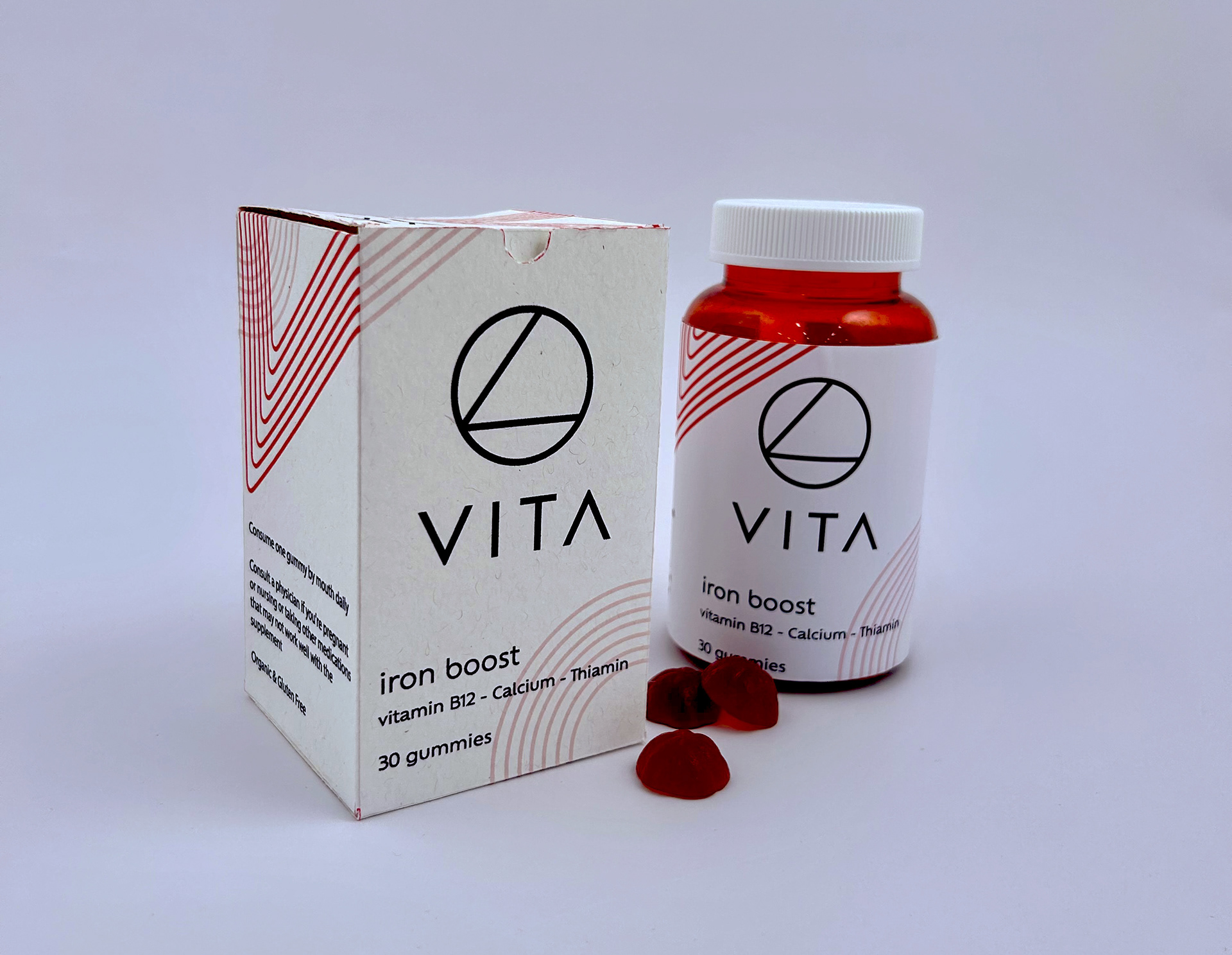
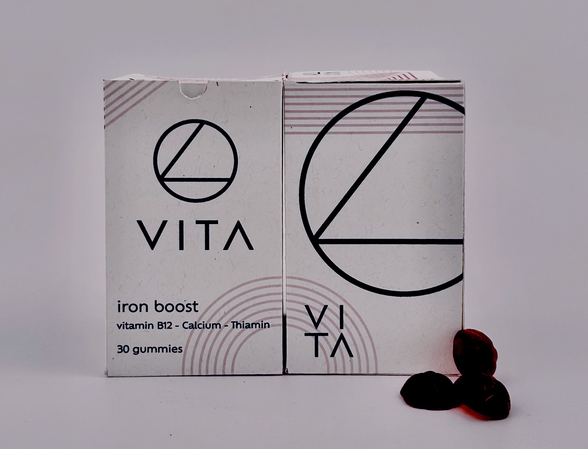
The logo is simple, modern, clean, leaving the impression the brand is high end, healthy, and trustable. The circle represents the shape of the gummy, while the lines inside is the V from the logo on a tilt. To make the aesthetic of the brand modern and clean there was not a need to bombard the packaging with too many colors. The simple white canvas allows for the geometric designs to stand out. The linear design is the logo deconstructed.