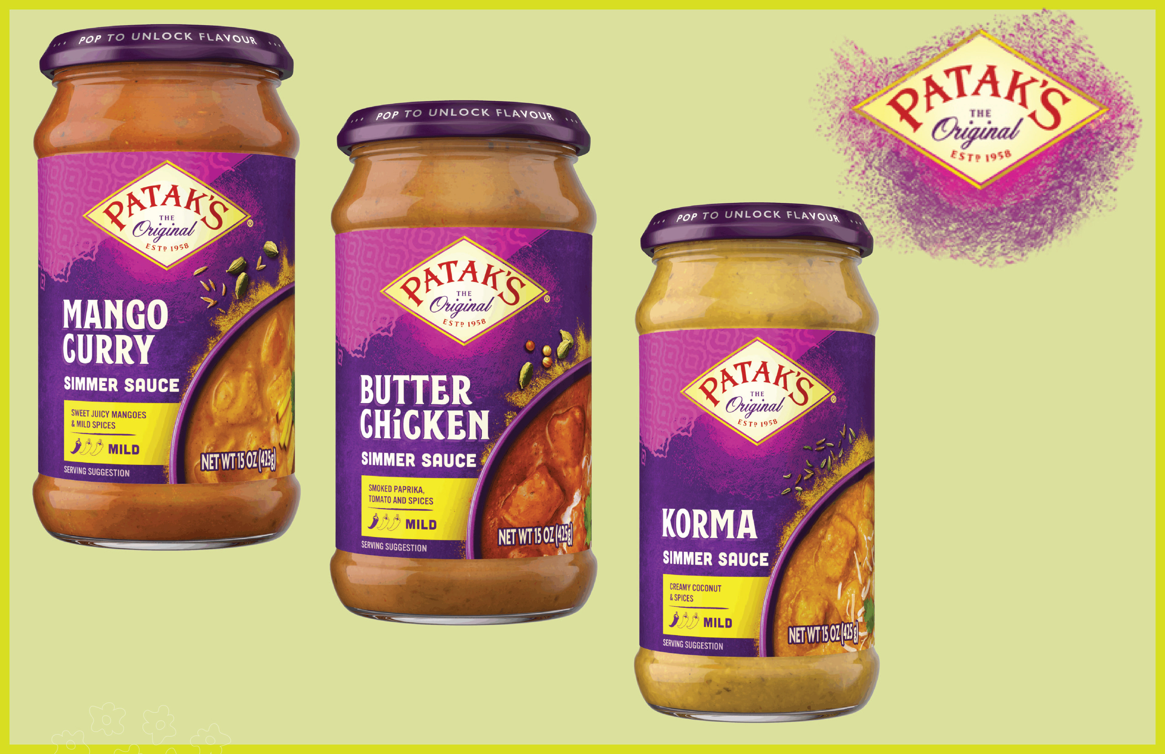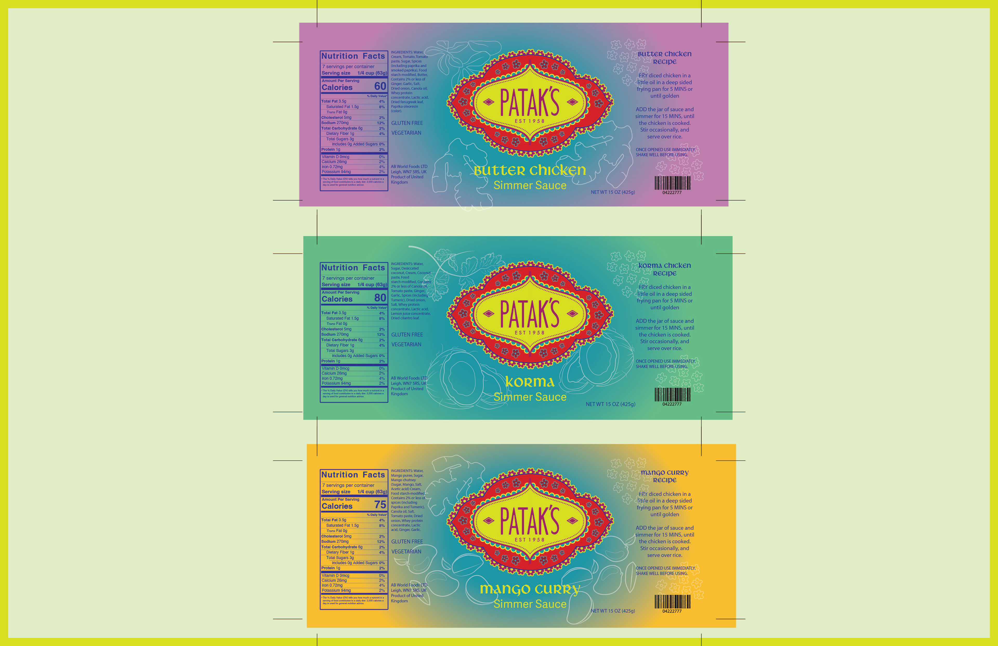
Patak’s is an Indian cuisine brand that offers a wide range of jarred goods sold in retailers across the United States. The company is known for bringing authentic Indian flavors into everyday cooking. This design concept was developed to visually express the bold, rich character of Patak’s simmer sauces, translating the intensity and depth of their flavors into a compelling and flavorful visual identity.
This design concept was developed to visually express the bold, rich character of Patak’s simmer sauces, translating the intensity and depth of their flavors into a compelling and flavorful visual identity.
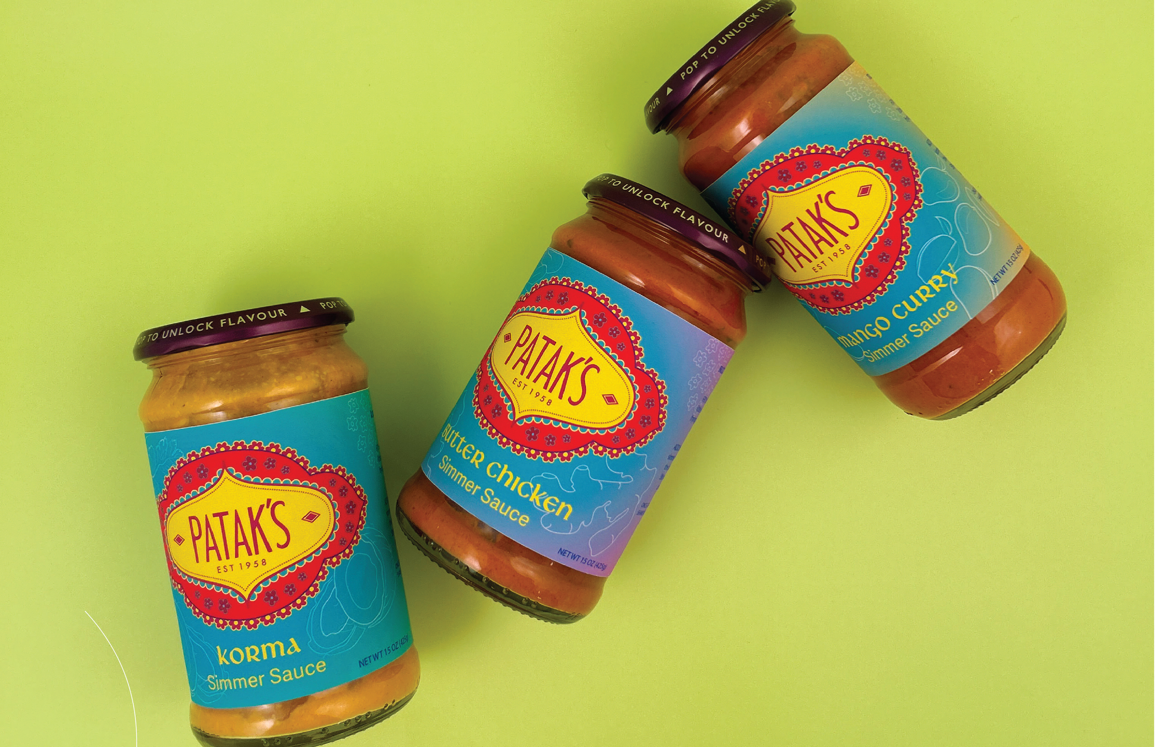
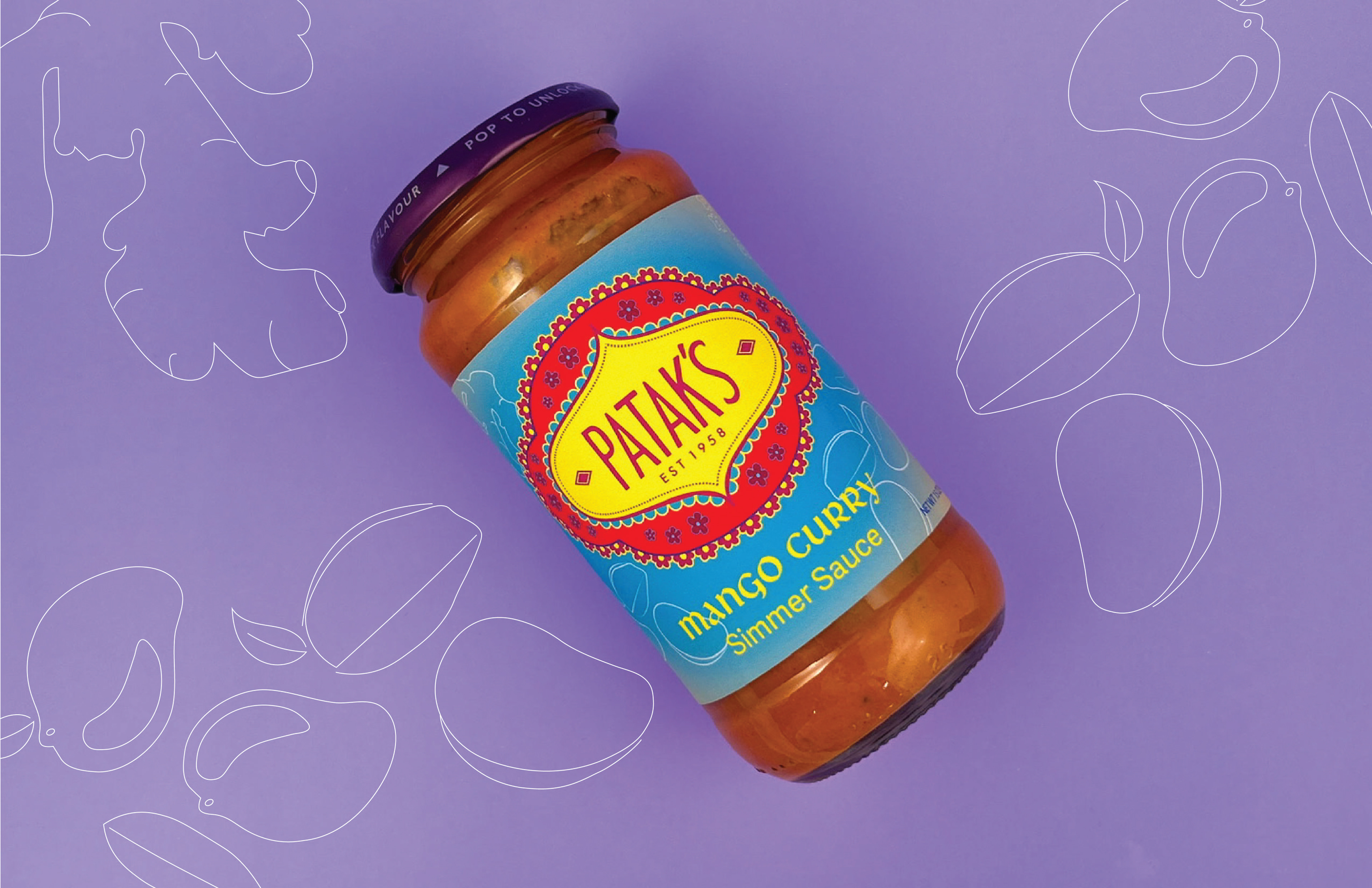
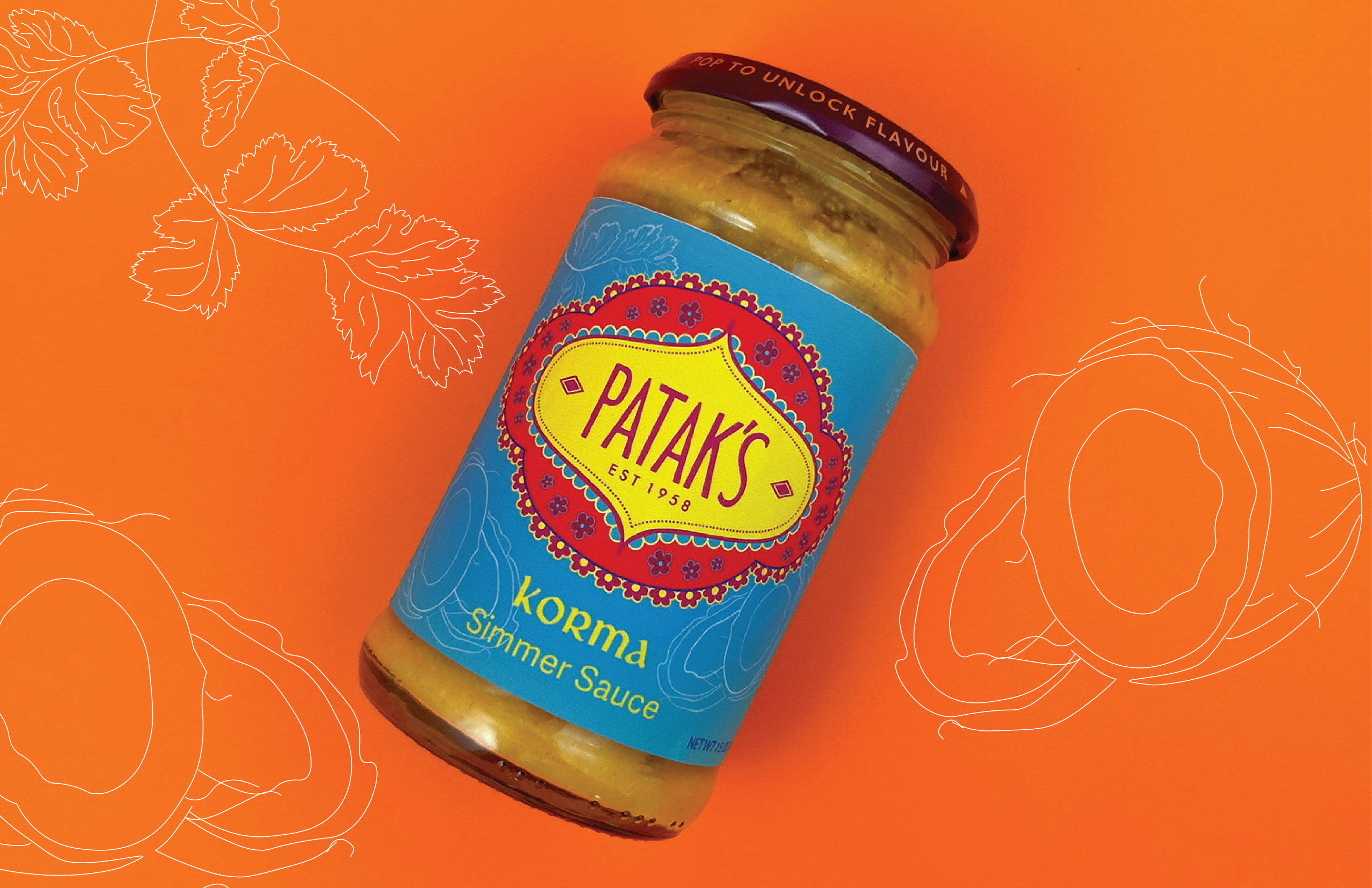
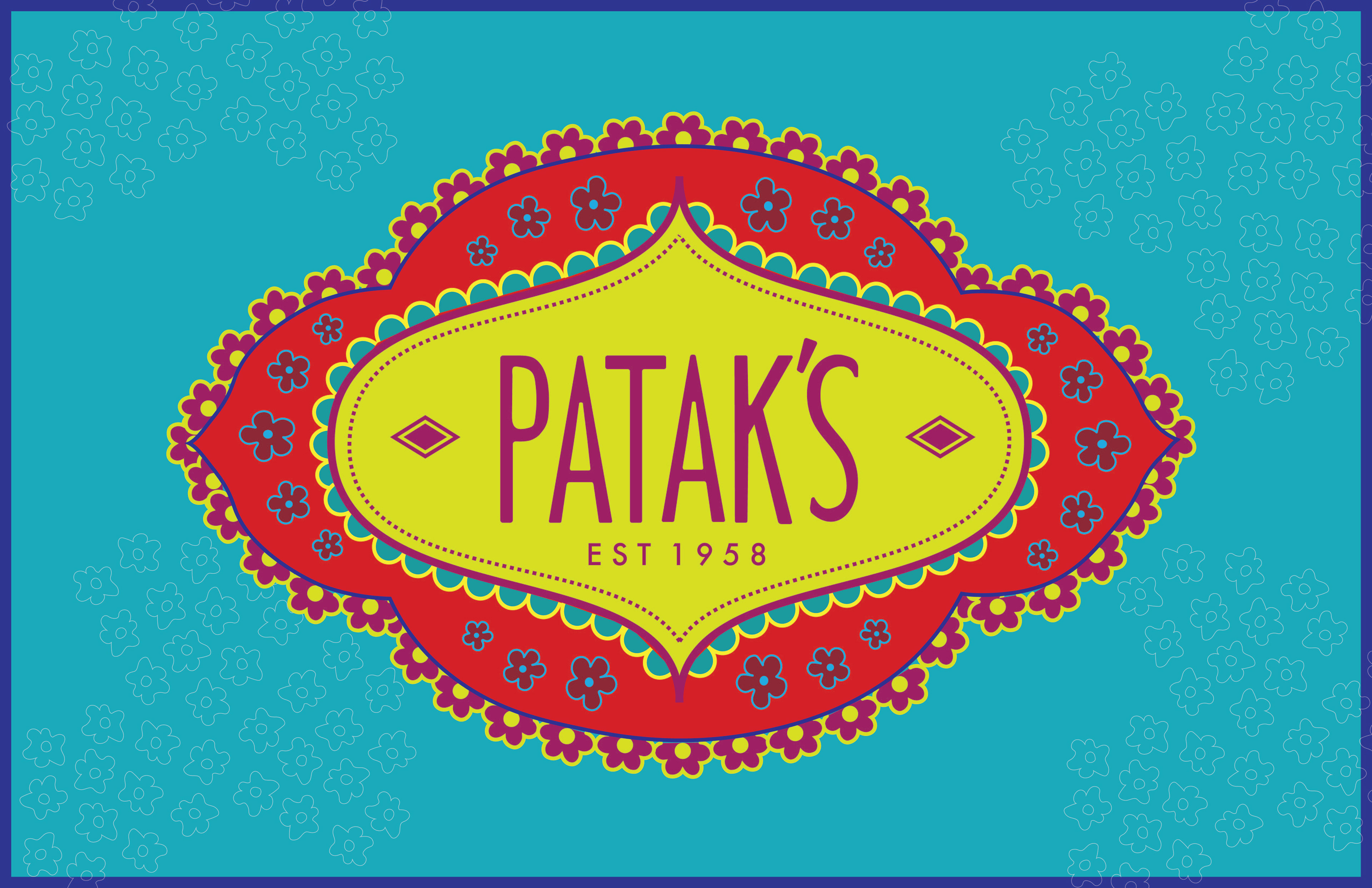
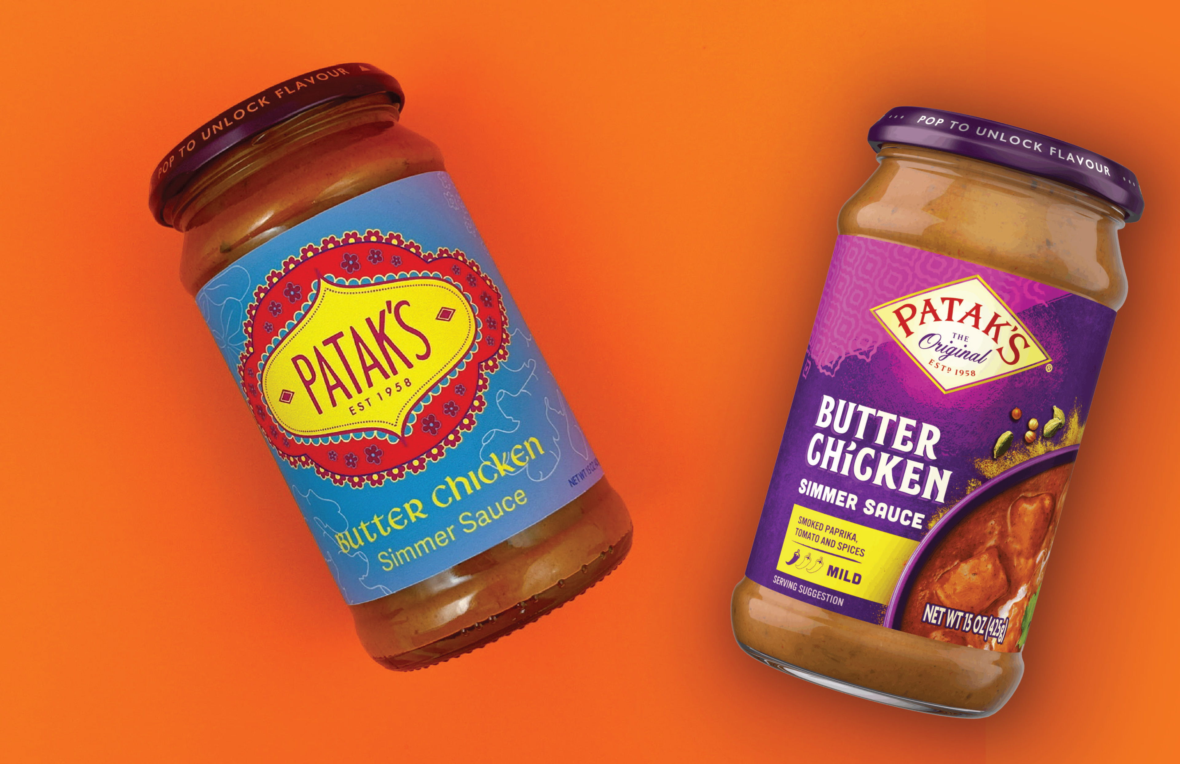
The original logo and product design lacked cohesion and a strong sense of authenticity. This redesign aimed to create a more compelling shelf presence by introducing vibrant colors and bold pattern work that immediately capture attention. The logo was elevated through increased scale and positioned as a focal point, complemented by traditional Indian fabric–inspired designs that reinforce cultural heritage.
Throughout the redesign, careful consideration was given to preserving the brand’s desired homemade and natural character. By balancing visual impact with authenticity, the refreshed packaging successfully enhances both brand recognition and consumer appeal.